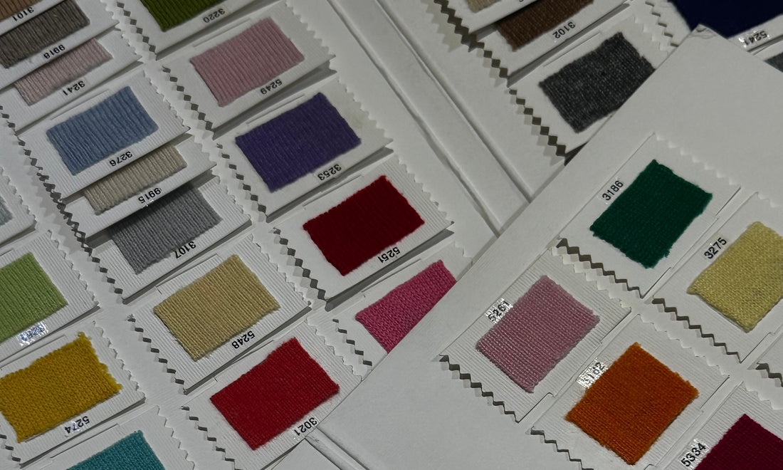
When it comes to Mandkhai’s winter collection, colour is more than just a visual element—it’s a reflection of instinct, emotion, and the natural world. This season, the palette is rich, warm, and carefully curated to balance timeless style with bold experimentation. Shades of deep red, burgundy, a spectrum of browns with subtle red undertones, and earthy beiges take centre stage. Each hue is designed to tell a story, one rooted in both nature’s beauty and the emotional landscape of the present moment.
The Art of Colour Selection: Instinct Over Trends
Unlike many fashion brands, Mandkhai doesn’t chase seasonal trends. Instead, the process is deeply intuitive. Founder Mandkhai chooses colours based on what feels fresh and exciting—what she describes as “something in the air.” Colour, she believes, is psychological. It reflects collective emotions and the global zeitgeist, influenced by subtle shifts in the world around us.
“I don’t follow fashion trends,” she explains. “Once you start looking at trends, it’s easy to subconsciously recreate them. I approach colour from a consumer's perspective, focusing on creating pieces I would personally wear, rather than drawing inspiration from fleeting trends."
Instead, nature serves as her primary muse. “What looks good in nature usually looks good on people,” she says. From the ochres of Mongolian soil to the deep reds found in autumn foliage, Mandkhai draws on organic colour combinations that feel both timeless and grounded. After all, no one does colour better than nature!
Creating Unique Shades: A Signature Approach
One of Mandkhai’s unique selling points is her ability to create custom shades. These aren’t colours plucked from a standard palette—they’re crafted to be distinctive, versatile, and flattering across a wide range of skin tones. “Just because it’s cashmere doesn’t mean it has to be beige,” she notes. “We love experimenting with daring colours that challenge traditional cashmere aesthetics.”
This season, that experimentation led to the introduction of unique tones like a rich red and a soft beige infused with hints of brown. Each colour is meticulously developed through a process of trial and error, from selecting the initial swatch to seeing how the shade translates onto the final garment.
“A colour that looks perfect on a tiny swatch can feel completely different on a finished piece,” Mandkhai explains. “If it doesn’t work, I won’t waste material. The goal is always to create something beautiful and wearable.”
Collaborative Creativity: The Role of Feedback
While instinct drives much of the creative process, feedback plays a critical role in refining the final palette. But Mandkhai is selective about where she seeks input. “I only ask for feedback from people whose opinions I trust—especially our production team. They have a deep understanding of how colours interact with cashmere and how they’ll be perceived by customers.”
Color selection isn’t just about personal preference; it’s about finding hues that resonate with a broad audience while staying true to the brand’s ethos. “We always ask: Will this piece be wearable? How will it style with other pieces in the collection?” This practical approach ensures that each colour not only looks good but also integrates seamlessly into a customer’s wardrobe.
The Influence of Environment
Environmental context also plays a crucial role in color selection. What looks stunning against the dramatic landscapes of Mongolia might not translate as well in European cities. “In Mongolia, lighter shades tend to be more popular, while in Europe, customers often gravitate toward deeper, richer tones,” Mandkhai notes. Years of experience have taught her to tailor palettes for different markets, ensuring that each collection feels relevant and desirable, no matter where it’s worn.
A Personal Touch: This Season’s Favorite Hues
When asked about her favourite colour this season, Mandkhai points to lime green and ice blue—unexpected choices that reflect her personal taste. “Lime green is a cool tone, and it’s surprisingly flattering. It brings a fresh, modern edge to the collection.” These colours, while daring, are carefully balanced with the more neutral shades, offering customers both versatility and a touch of boldness.
Beyond Color: A Reflection of Brand Values
At its core, Mandkhai’s approach to color is a reflection of the brand itself—bold yet refined, grounded in tradition but unafraid to innovate. Each shade represents more than just a fashion choice; it’s a celebration of nature, craftsmanship, and the uniqueness of cashmere.
“Our colours are meant to evoke emotion and connection,” Mandkhai says. “They reflect the landscapes of Mongolia, the resilience of its people, and the timeless elegance that defines our brand. When you wear Mandkhai, you’re not just wearing cashmere—you’re wearing a story, a piece of heritage, and a symbol of beauty that transcends trends.”
As Mandkhai continues to evolve, the commitment to thoughtful colour selection remains a cornerstone of the brand. It’s not about following what’s popular—it’s about creating something enduring, something that resonates on a deeper level.

